Pop Culture Artwork
Usually with artwork I take a photo of something that fits with the theme of the music or use an existing photo that fits equally as well but for Pop Culture I wanted something different.
I had this idea in my head that I wanted it to be a can of pop with the Backroom Stereo logo and EP name on. The EP is called Pop Culture because 5/6 songs reference something to do with popular culture, it’s also incredibly poppy in its theme!
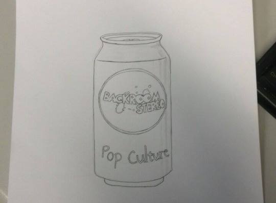
The problem was that I needed to get perspective right and I can’t draw, so Becki, a friend of a friend came up with this for me.

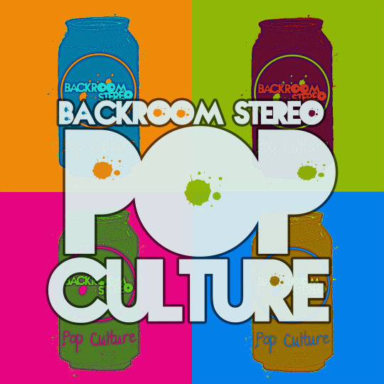
From this drawing I added it into photoshop and spent a few hours messing around with it and playing with different ideas and finally settled on the idea of it looking like pop-art in style to further tie into the ‘pop’ theme of the EP.
And so here is the finished artwork for Pop Culture (expected to be released in May)…it’s my favourite artwork for anything I’ve ever done and I think it looks awesome!

